

OVERVIEW
ABOUT THE PROJECT
This case study is about the design concept of the brand new digital wallet PayLine, which I have strategically planned and designed as a responsive web app to be the easiest way for sending, receiving and saving money.
PROBLEM STATEMENT
Through the restrictions of the pandemic the physical presence of money or a bank branch is dwindling. Humans need a simple and secure mobile alternative that allows them to take control over their finances.
Solution
A free and safe app with fingerprint or facial recognition system, intuitive to use and equipped with a strong customer service. A clear and fast app that offers easy to set up sub-accounts. Assets up to 100,000 euros need to be secured.
MY ROLE
UX/UI Design Lead (Solo Project) including research, user interviews, usability tests, ux writing, wireframing, prototyping.
DURATION
6 months
DELIVERABLES
83 Screens
TOOLS
- Pen & Paper
- Google Forms
- Balsamiq
- Optimal Sort
- Usability Hub
- Miro
- Adobe XD
DESIGN THINKING PROCESS

RESEARCH
INTERVIEWS
At the discovery phase of my project, I conducted user interviews with 25 people as diverse as possible. The only thing they had in common: online banking was still a part of their life. I wanted to find out:
1. If there is a market for a profound cyberwallet
2. Understand what features our potential users value the most
3. Understand the motivation to start using a financial app
WHAT PEOPLE SAY

AFFINITY MAPPING

SUMMARY
There is a market for a profound cyberwallet. Lockdowns during the pandemic had affected the financial activities of all the interviewed participants:
- 100 % think that security in online banking is extremely important and are willing to pay for it a couple of euros per month.
- 100 % want a more frictionless, modern, clear and intuitive way to use online banking, presented more in the human language.
- 100 % want a fast paperwork-free app, do transactions, save money, get a quick overview of the account without having to go into a bank branch.
USER PERSONA
Based on the interviews, I created the persona Ka to see this whole project through her eyes and make decisions with her needs and goals. That was especially useful to develop the main functions of the app.

THE SITEMAP
Regarding the persona, the main functions were clear. So I created a sitemap.

Now it was time to start drawing wireframes by sketching on paper to decide which ideas will work out best.
WIREFRAMING
Pen & Paper Sketches
The most important app features are sending, saving and receiving money as well as Scan/Pay and split a bill equally. As a result, the low-fidelity prototype would focus on these features. See a selection below.
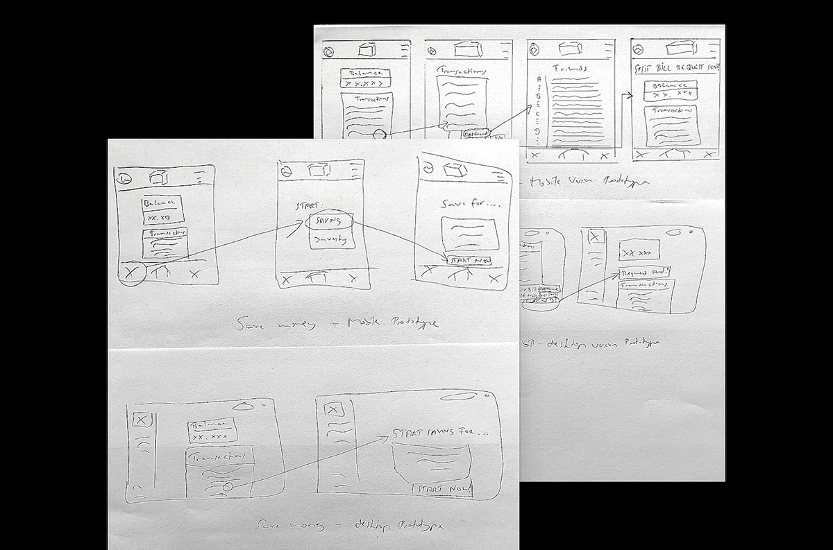
The main purpose of the low-fidelity wireframes was to check if the navigation really would make sense and how the app could look like. They don't represent the final product and I implemented many changes before I went to create the main paths. To get scalable prototypes, I translated them into mid-fidelity frames.
Mid-Fidelity Wireframes
Some changes were necessary to prevent cluttering and account for the spacing …

As soon as I had finished the mid-fidelity wireframes, I moved on in the prototyping design process and translated these screens into high-fidelity wireframes using Adobe XD.
HIGH-Fidelity Wireframes

USABILITY TESTING
Now that I had a high-fidelity prototype, it was time to test the design with real users to identify any pain points and errors. To help me define, clarify and communicate the test objectives and goals of the usability test, I created this test plan:

Test Result Evaluation
After six interview session that I have recorded, I extracted the main quotes and sorted them.

Then I implemented the feedback in my designs.


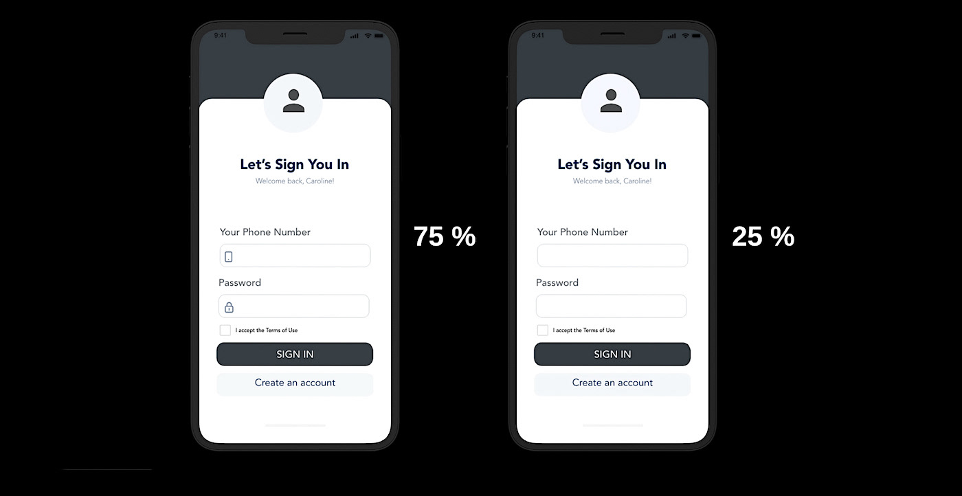
Based on the feedback from further Guerilla testings, where some participants mentioned their preference of having icons inside the box forms while others mentioned otherwise - I felt it seemed like the perfect opportunity to do them both and perform an …
A/B-TESTING with 12 Participants: VIEW THE TEST
DESIGN EVOLUTION


FINAL DESIGN


DEMO VIDEO OF three core Features
Add a new savings plan
Split a bill equally
Scan/Pay
CLICKABLE PROTOTYPE
Thank YOU!
Your feedback is always highly appreciated


